
OPINION
A new era for visually impaired learners’ experience
By Clare Slusar and Nicola Willis
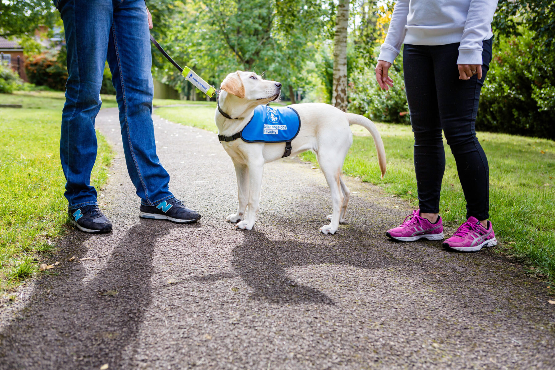
A project with the Guide Dogs for the Blind Association was an opportunity to work with experts in accessibility for learners with sight loss. What we learned has fed into improving elearning tools, convinced us Adapt really is the best option for accessibility, and sparked hope for a new era in elearning experience.
We were both closely involved in developing the course about dog training, making sure it offered a great learner experience to people with and without sight: Nicola from the software engineering side, and Clare from an elearning design perspective. The project challenged the technology and our perceptions. We want to share some of that, and hopefully help others make better elearning.
Testing a range of elearning with screen readers for ourselves: revealing!
CS: I found using a screen reader, admittedly as a novice, incredibly frustrating. But using a screen reader with sight was an interesting perspective because I could see what I was missing. For example a lot of animation, and older content anything that uses Flash, just gets skipped over – the screen reader can’t get any information from it.
NW: Even with modern HTML, you’d realise the screen reader had skipped things. For example it would read the question and then give you the answer button – but no answer options! You’d have to submit a random answer to move on.
CS: When you’re not looking at the screen, things quickly stop making much sense. I realise there’s a lot of learning content that says it’s accessible, but it’s at a minimal level. Far from a satisfactory learner experience! As an industry I think we’ve been kidding ourselves about how accessible online courses have been.
“I think we’re finally approaching an era when asking, ‘How will this work with assistive technology?’ is as fundamental as considering the mobile experience.”
Nicola Willis
Software Engineer
Working with people who use screen readers every day: vital to improve elearning tools
CS: Expert screen reader users work really fast! Just as I’d skim over a page of text visually to quickly find what I need, they use keyboard controls to fly around web pages listening to headings, then focussing on the bit they want. If the content has been built accessibly, that is!
NW: Getting into the details of how everyday assistive technology users navigate – for example the control keys and sequences they use – helped us re-engineer Adapt components so courses are more fluid and intuitive.
“The team we worked with at Guide Dogs were fantastic at explaining the hows and whys of navigating with assistive technology. That was vital to us making changes that would work for real-world use.”
Clare Slusar
Elearning Designer
Adapt-based elearning: our first choice for this project

CS: Adapt’s been our go-to tool for authoring for a few years now. It’s what led us to start contributing features back to the open source community, and led to Can Studios becoming official Adapt collaborators.
For this project there really was no question. Adapt-based elearning uses HTML5: its built-in structure and hierarchy gives screen reader users a logical, signposted path to navigate by.
NW: Also, because HTML5 content works responsively across different devices, sizes and orientations, content displays sensibly as you zoom in and out.
For people using screen readers or keyboard control (rather than a mouse), an Adapt-based course built from a few, deep scrolling pages is far easier to whizz around than a course made up of lots and lots of separate slides.
CS: But importantly, because Adapt is open source, when we need to do something more, or differently, our developers can build or re-engineer plugins. As a course designer, that’s such a luxury!
Re-engineering Adapt components to work better with screen readers
CS: Take Adapt’s stack list component for example. Our in-depth screen reader tests spotted a problem: the button to reveal the next item sits below the list content.
As a sighted user, the movement of the content appearing draws your eyes back up the page to read it, then you instinctively skip back down to the big button beneath, back up to the newly revealed content and so on.
But once the screen reader had landed on the reveal button, it wasn’t being instructed to ‘look up’ again, so a visually impaired user would skip past without being presented with all the points. Our developers were able to change that behaviour – making the stack list component truly accessible via screen readers.
NW: We also did lots of testing of other components – including the hot graphic, accordion and narrative interactions – and shared our findings with the Adapt community to help with finding fixes for them.
Our developers were able to change the behaviour of stack lists to make them truly accessible via screen reader.

Big accessibility improvements with the Version 4 Adapt framework
NW: Improving elearning for disabled people has been a big focus for the Adapt Learning community over the past year or so. Version 4 of the Adapt framework, released in January 2019, delivered big improvements.
The work that led up to that, and the features it’s introduced, shone a light on accessibility.
Yes, at Can Studios we’ve been doing a lot of development in this area; and the Guide Dogs project meant we had a lot of user insight and feedback to contribute – along with code. But we’re definitely part of a bigger movement.
Changes to learner experience with courses built on the Version 4 Adapt framework
CS: In courses built with the version 4 framework the keyboard navigation is more intuitive because it’s been brought in line with the way screen reader users navigate modern web content everyday. And an Adapt online course is, in many ways, a very interactive web page.
NW: Improvements to the HTML structure of pages also make them easier for screen readers to parse – helping visually impaired elearners stay oriented and work efficiently.
Take headings as an example: menus, pages, articles, block and components now give a screen reader the heading level – and whether or not the item is completed. This makes it much easier to quickly jump around the page, get an idea of the module’s overall structure and where they are up to in the course.
Accessibility mode is dead…
Long live accessibility!
Adapt Framework Version 4 put accessibility for all at the heart of this open source e-learning tech. Starting by getting rid of the accessibility mode. Yes, really…
Responsibility at every level
CS: As a company I’m confident we’ll use what we’ve learned on this project to raise other clients’ expectations of what they could and should require for accessible elearning.
As an industry – and individually – we need to be thinking about accessibility on lots of levels. There are things that are up to me as a designer – writing good alt-text for images, making sure colour contrast and type sizes are appropriate for example.
NW: And there are things we need to do at a software development level. For example Adapt interactions can now carry an introductory description, so as a screen reader moves through the course the learner gets a brief explanation of each interaction that says what type it is and how to navigate it. I can make sure those are in place (and appropriate!) in my work, but as Adapt collaborators we can use our influence in the community to encourage and help others get this right.
Nowadays we can’t imagine anyone designing a user interface without asking ‘How will this work on mobile?’. But with the release of the Adapt version 4 framework I think we’re finally approaching an era when asking ‘How will this work with assistive technology?’ is as fundamental as considering the mobile experience.
With that in mind – here’s our list of…
5 tips for making elearning more accessible to visually impaired learners
We’d urge you to try Adapt authoring as a first step to making your elearning more accessible. But whatever authoring software you use, our top five things to remember are:
1. Test with a screen readers, magnification and other assistive tech – obviously the best people to advise on and test your content are those who are visually impaired themselves. RNIB provides a range of advice and user testing services to businesses. If you don’t have a budget for this, at least make sure that you try the content via assistive tech yourself. There are a number of assistive technology tools you can test with at no cost.
2. Avoid redundant and repetitive info – when providing descriptions for elements such as buttons or image links. The element type will already be given to the screen reader by the underlying code. For example, a button with a triangle is often used to play content. If you label this “Play button” the screen reader will say “Button: Play button”. Such duplication just slows down the reading. Rather, think about how you can…
3. Give context with your interface labels – for example telling a user that an item is one of four gives them more context than just hearing one, two, three… and not knowing how many more to expect. For items such as buttons, you can add labels that screen readers present instead of the button text: where a sighted user might see a button saying “Next”, a screen reader could announce the button with “Go to next list item” (rather than “Button: Next”) to provide more context.
4. Write good alt text for your images – think about the purpose that the image serves this article from Webaim gives good pointers on alt text for decorative images, functional images and more complex cases.
5. Provide sufficient colour contrast – make sure objects and text have sufficient contrast with the background. There are a variety of online tools that can help – such as accessible-colors.com where you can enter the hex value for your background and text colours to discover the contrast ratio and whether this meets WCAG 2.0 guidelines for contrast accessibility.